

While it may not be the most comfortable topic to bring up, effective donation pages are one of the best ways to increase donations to your church. After all, the funding for important programs like children’s church, outreach events and caring for the needy in your community usually doesn’t appear out of thin air.
Rather, it comes from your church members, other attendees and members of your local community who see the good you’re doing.
Table of Contents
- Importance of Effective Donation Pages for Churches
- Understanding Church Giving Trends
- Key Elements of a Successful Donation Page
- Enhancing the User Experience
- Donation Page Design Examples
- FAQs
- Free eBook: Unlock the Secret to Successful Stewardship
Importance of Effective Donation Pages for Churches
Donation pages are a crucial way to promote your fundraising efforts. They are extremely effective, bringing in more recurring revenue on average than any other type of campaign. They are also easier to share through social media, email and other digital means you have to communicate with your parishioners. Digital donations don’t come with the administrative issues of checks, which can expire, and cash, which is easy to lose track of when managing large quantities.
For all of these reasons and more, effective donation pages are becoming more and more important. However, for your donation page to achieve the desired results, you’ll need to make sure it stands out.
What Makes a Great Donation Page?
While preferences on details like colors and button shapes vary, there are a few best practices for how to make a donation page that you can use to build a great page for your church, including:
- Mobile-friendly design: A good donation page is easy for people to access, regardless of the device they are using. Make sure your donation pages are responsive to different screen sizes to ensure people can donate from their laptops, tablets, smartphones or computers — whatever they have handy at the moment.
- Clarity around accepted methods of payment: Whether you accept credit cards, debit cards, a cash-sending app like Zelle or any other option, people want to know if you can accept their preferred payment methods. When you are clear about this up front, you can avoid potential donors’ frustration at their payments not going through when they try to donate.
- Consistent brand identity with other church pages: It’s important to make sure potential donors can recognize your organization based on the donation page and know where to get more information about what you’re doing with these funds. Clear branding encourages trust and makes it easier for people to find you again if they want to donate more down the road.
To learn more about these best practices and more trends and elements that will make your donation page an integral part of your fundraising strategy, read on.
Understanding Church Giving Trends
The culture we live in is constantly changing, and to continue reaching and impacting new generations, we have to keep up with church giving trends. Here are some of the most important trends you need to understand before setting up your donation page.
Current Trends in Church Donations
One of the most concerning trends in many churches is that only about 10 to 25 percent of the congregation tithes. While this can still add up to a hefty sum, it’s a far cry from the money your church would have to work with if tithing was more commonly practiced. In a similar vein, about 17 percent of Americans surveyed say that they tithe.
Although tithing isn’t very popular with young Americans, that doesn’t mean donations in general have declined. For example, in 2022, church donations increased by 3.6 percent. Many Christians still feel strongly about giving back to their church homes, even if giving a full 10 percent of their income isn’t possible or prioritized at this time in their lives.
One of the best ways to make it easier and more popular for people in your congregation to both tithe and donate is to take part in the biggest church donation trend: a move toward more online donation tools.
The Shift Toward Online and Mobile Giving
A study that included over 2,000 churches discovered that for churches that have mobile apps, donation pages are among the most-used features. These pages empower churches not only to accept donations from parishioners at any time — though that alone is great — but also provide an option to communicate fundraising goals and the church’s biggest needs in record time. This also ensures that congregants can give whenever they feel moved to do so.
Rather than having to wait for the next Sunday or Wednesday service to give, people can donate from wherever they are by simply opening an app or clicking a link. This convenience is especially helpful for people who may not always be able to attend in person, such as elderly folks who depend on rides from others or families who may need to stay home often due to children getting sick. The consistency and accessibility that online donation forms offer are practically unmatched, making them a great part of your fundraising strategy.
Now that we’ve discussed some reasons that online and mobile giving are continuing to increase in popularity, it’s time to discuss the most important parts to include in your church donation page.
Key Elements of a Successful Donation Page
While there’s nothing wrong with launching a minimum viable version of your donation page, to reap the benefits of sharing this page with your congregation, there are a few key elements that you must consider.
1. Donation button visibility
It doesn’t matter if you have a donation button if no one can see it! To ensure that it is visible, first, be sure that it is high on the page — ideally, above the fold on any device. That way, people will not need to scroll to access it. Also make sure it’s large enough for people to see and in a color that attracts the eye.
In addition, be sure that it’s easy to read. For example, many people have a hard time reading white text on a brightly colored background, so you may want to avoid that. If you use bright colors for the donation button, try using bold or shadowed text to ensure legibility.
2. Mobile-friendly design
Statistically, most people will access your page on a mobile device, even if you don’t have a specific mobile app. Mobile-friendly donation page design elements include:
- Smaller blocks of text that make it easier to read on small screens
- Fewer images to keep load speed fast
- Larger buttons that enable tapping with fingers instead of clicking with a cursor
- A dynamic display that can shift depending on the size of the screen someone is using so they do not need to scroll from left to right
Before sharing your donation page with the congregation, be sure to pull it up on a tablet or mobile phone and check for any difficulties you experience there that may not be noticeable on a desktop.
3. Consistent branding and color scheme
No matter what page of your website someone is on, it should be recognizably and uniquely you. Though it may be tempting to add bright colors or different design elements to your donation page to grab attention, try to resist this urge. Instead, it’s better to be consistent so you can build trust and rapport with your donors. Nonprofit donations are important, but there are many scammers out there trying to steal money from legitimate donors, so it’s important to ensure that people can identify what is actually your website versus what might be fake.
4. Simplified donation forms
There is a time and a place to learn everything about each individual church attendee, but the online donation form is probably not the place. Instead, try to make donation pages as streamlined as possible so people don’t run into issues with missing information, reloading pages, or getting distracted before they complete their nonprofit donations.
5. Recurring donation options
One way to make donations even more convenient is by providing recurring donation options. That way, people can automate their preferred donation or tithe amounts on a weekly or monthly basis, depending on when they get paid. This is especially helpful for people in busy seasons of life who may fully intend to give on a consistent basis but forget to bring their checkbooks to church. It’s a great way to streamline the donation process for everyone by making it easier to automate their preferred donation amounts and frequencies.
6. Security and trust indicators
The most important first step you can take to make sure your donation page is secure is getting an SSL certificate. Without this, many devices and browsers will alert users that the page is not secure and recommend against staying on it. This is likely to prevent many people from using your donation page, even if it is otherwise set up well.
In addition, be sure to let users know whatever security you provide when they share their payment information. Is the data encrypted? Do you use a trusted service provider to transfer money? Who has access to their payment information? Anything you can do to build trust and prevent unnecessary access to payment method details goes a long way toward establishing trust as people use your new donation page.
Best practices change a lot, so it’s important to stay up-to-date with online giving resources to ensure that each charitable donation is as seamless as possible.
Enhancing the User Experience
Once you have the key elements of your page down, it’s time to make it more enjoyable! Here are some ways you can enhance your congregants’ experience when they choose to make online donations.
Visual Appeal
Consider adding elements like graphics, short videos or fun images that will be pleasant for people to view. Graphs are also great to add, especially if you have relevant data on what their donated money goes toward and how that impacts your church and wider community.
Speed and Accessibility
The longer your page takes to load, the more likely people will click away or assume it’s not up and running. The best practice is to keep your load speed for any page to 3 seconds or less. If you can’t get it to load that quickly, just know that the closer you can get to it, the better the experience for your donors. It also makes your donation page easier to use for people with limited access to the internet.
In addition, it’s important to make sure your page is accessible. For example, it’s important to include alternative (alt) text for images so people using screen readers can still consume the content. Another way to increase accessibility is to use large font sizes and allow users to zoom in as needed to enlarge the font.
Content Above the Fold
With any page, the most important content should be above the fold. This helps keep people from leaving the page almost immediately because they are confused or surprised by the visible content. It's also a place where storytelling is vital. Use this space to share the stories of those your church has helped.
If your page will require people to scroll for certain functions, be sure to prioritize your donation button and any disclosures as items to go above the fold along with these storytelling elements.
Below the fold, you may consider including a donation request letter or some information about how each donation has an impact. Another great thing to include is if you partner with any other charitable organizations, and if so, how. Photos, videos and who to contact if people have any questions about donations can also be great things to include lower on the page. Some pages even include reports or disclosures about how donations are allocated to different ministries.
Compelling Submit Button Text
There’s no need to write a novel on each button — in fact, we advise against it — but some fun submission button text can encourage people to go ahead and click it. It is also important to keep button text short to maximize the visual impact of the button. Here are some ideas for text to put on your button:
- Support Our Mission
- Give Now
- Help Us Help Others
- Donate Today
- Make Your Online Donation
Your ideal button text depends on your audience and your church’s branding, so be sure to customize it based on what is authentic and compelling to you.
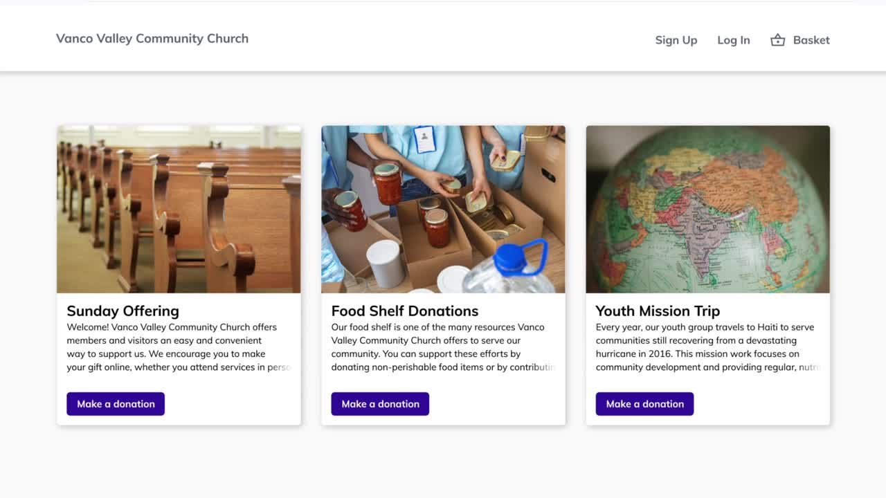
Donation Page Design Examples
Now that we’ve gone over what makes a great donation page design, it’s time to review some examples. Gather inspiration from these successful donation pages as you brainstorm how to design yours!
Trinity Episcopal Church
This donation page is perfect for Trinity Episcopal Church’s congregation, which includes many senior members. The ask is clear, and the form is straightforward, barely requiring any scrolling to fill out and submit. To learn about how their regular pledge drives have impacted giving in a positive way with this page, check out their story.
Faithpoint United Methodist Church
Faithpoint’s donation page is simple to the eye, which is part of what makes it so effective. In fact, by expanding their online donations, Faithpoint was able to give overall donations a 20 percent lift. This makes a huge difference in their ability to care for their congregation and reach their broader community! To learn more about how they did it, see what their senior pastor has to say.
What Do These Examples Have in Common?
Each of these donation pages is designed differently with their congregation and needs in mind. For example, congregations with older populations may want to have a simpler, more straightforward approach with classic Christian images. However, younger churches may benefit from using stock photography and strong language to strike a chord with their attendees.
To make sure your donation page is as effective as possible, assemble a focus group that represents your congregation. For example, if you know that a lot of young families attend your church, you may want to include a few parents of young children; if your youth group is thriving, some older teens and young adults can share some valuable insights. Consider asking your volunteers if anyone has experience in building pages like this and whether they would be willing to share their thoughts and feedback as part of their volunteer work.
FAQs
What are some common mistakes to avoid when designing a church donation page?
Some of the most common mistakes on church donation pages include not prioritizing mobile-friendliness, slow load speeds and inconsistent branding. You can avoid these mistakes by making sure you use a platform that can adjust for mobile devices, testing your load speed with a free online checker before launching it and reviewing the branding on the page compared to the rest of your website to make sure it matches up.
How important is the page load speed for a church donation page?
Load speed is extremely important. It improves your users’ experience, makes your page more accessible and even helps your search engine optimization (SEO) if you can keep your load speed to 3 seconds or less. If you have checked your load speed and can’t seem to make it faster, consider implementing some tips from HubSpot, starting with compressing any images on the page.
Can social media integration improve the effectiveness of a donation page?
Absolutely. This makes it easier to share the donation page with your followers and makes it easier for donors to share the page with their social networks. This may encourage other church attendees they are connected with to donate or start conversations with some of their unchurched followers.
What role does storytelling play in creating compelling church donation pages?
The storytelling you use can encourage people to donate by showing them that you are making an impact. Some great ways to tell the story of your church’s impact on the Kingdom include sharing the numbers of new converts you’ve seen in the past year; how many people have benefitted from free programs you offer, such as VBS or food pantries; and how much you have been able to give to missionaries and what they are doing in their own communities. There’s no right or wrong data to include as you tell your story, but numbers can help show people how powerful even the smallest donation can be in the right hands.
How can churches personalize the donation experience for different donors?
Some great ways to personalize the donation experience include custom emails to each donor, a thank-you note included with their year-end giving statement and sharing special behind-the-scenes content in a regular donor newsletter for people who have donated to your church online. Another way to personalize the donation experience could be to offer people the ability to log in to a secure account where they can manage donations and access special resources.
What metrics should churches track to measure the success of their donation pages?
Important donation page metrics to track include the percentage of donations that happen online, overall giving increases and how many people have donated through your page in a certain period of time. Another great metric to track is your conversion rate. The conversion rate of a page is the ratio of overall visitors to the page to the visitors who complete a desired action, such as making a donation. This can give you an idea of whether people feel compelled to donate after visiting the page or if perhaps there are places where they are getting distracted.
Unlock the Secret to Successful Stewardship: An Unmissable Guide for Every Church Leader
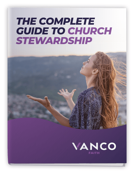
The topic of money and giving money to the church can be tricky terrain for church leaders. Yet at its core, stewardship is about empowerment, community and growth. With this perspective, we've developed an eBook that reframes this delicate conversation into an empowering discourse.
Our guide will…
- Help you tap into your congregation’s natural desire to contribute.
- Reveal eight fundamental rules of financial stewardship.
- Showcase 11 untapped revenue sources that could catalyze your church's financial health.
- Detail a foolproof blueprint of 17 key elements to design the perfect stewardship plan.
Transform the way you approach stewardship and unleash the power of giving with our breakthrough eBook.